How to Make Your SharePoint Site Look Like a Modern Website (Without Coding)

SharePoint is powerful but let’s be honest: default SharePoint sites don’t always feel like modern websites.
The good news?
With the right design approach, a few smart configurations, and modern webparts, you can transform SharePoint into a visually stunning, user-friendly, website-like experience that employees actually enjoy using.
This guide walks you through the exact steps, best practices, and real-world use cases for taking your SharePoint site from “just functional” to “beautiful, branded, and intuitive.”
Why Make SharePoint Look Like a Website?
A modern, website-like experience instantly changes how employees interact with your intranet:
1. Higher User Engagement
Clean layouts, visuals, and intuitive navigation encourage users to return.
2. Professional Brand Presence
Perfect for internal portals, leadership hubs, service centers, and external-facing sites.
3. Optimized Responsiveness
Works beautifully across desktop, tablet, and mobile screens.
4. Clear, Simplified Navigation
Clear menus and pages improve usability.
Step-by-Step: Transform SharePoint into a Website-like Experience
1. Choose the Right Site Template
Your foundation matters.
• For broad communication → Communication Site
• For content presentation → Topic or Showcase templates
Avoid classic sites unless you require heavy customization.
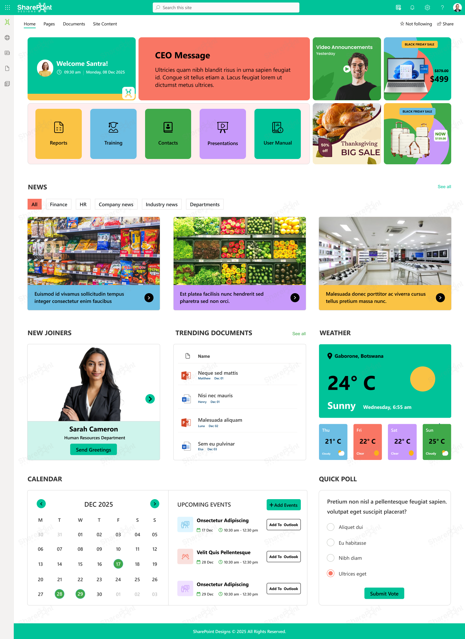
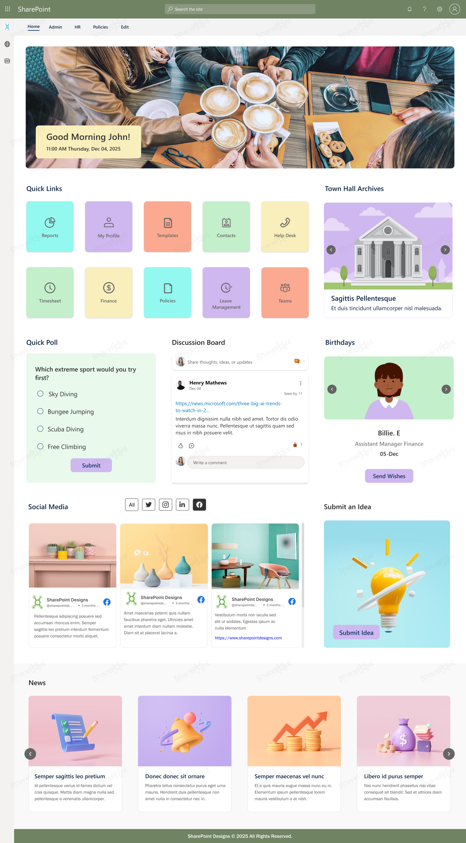
2. Design a Home Page That Feels Like a Real Website
Your home page is your “digital lobby.”
Use elements such as:
• Hero web part to highlight services, announcements, or campaigns
• Quick links for most-used resources
• Section layouts (grid, two-column, full-width) to create visual flow
A well-designed homepage sets the tone for the entire site.
3. Customize Branding to Match Your Identity
Navigate to:
Settings → Change the Look
Update:
• Theme: Apply brand colors
• Header: Use minimal/compact for a clean look
• Logo: Add your company logo
• Footer: Include links, copyright, addresses
Pro Tip: Use a 2–3 color palette to maintain visual consistency.
4. Use Modern Web Parts Strategically
SharePoint’s power lies in modular design.
Add these high-impact sections:
• News web part - storytelling and updates
• Document library - brochures, policies, guides
• Image/Gallery - visual branding
• Video (Stream or YouTube) - onboarding, training, campaigns
More on this: Web Parts That Make Your SharePoint Intranet Feel Like a Website
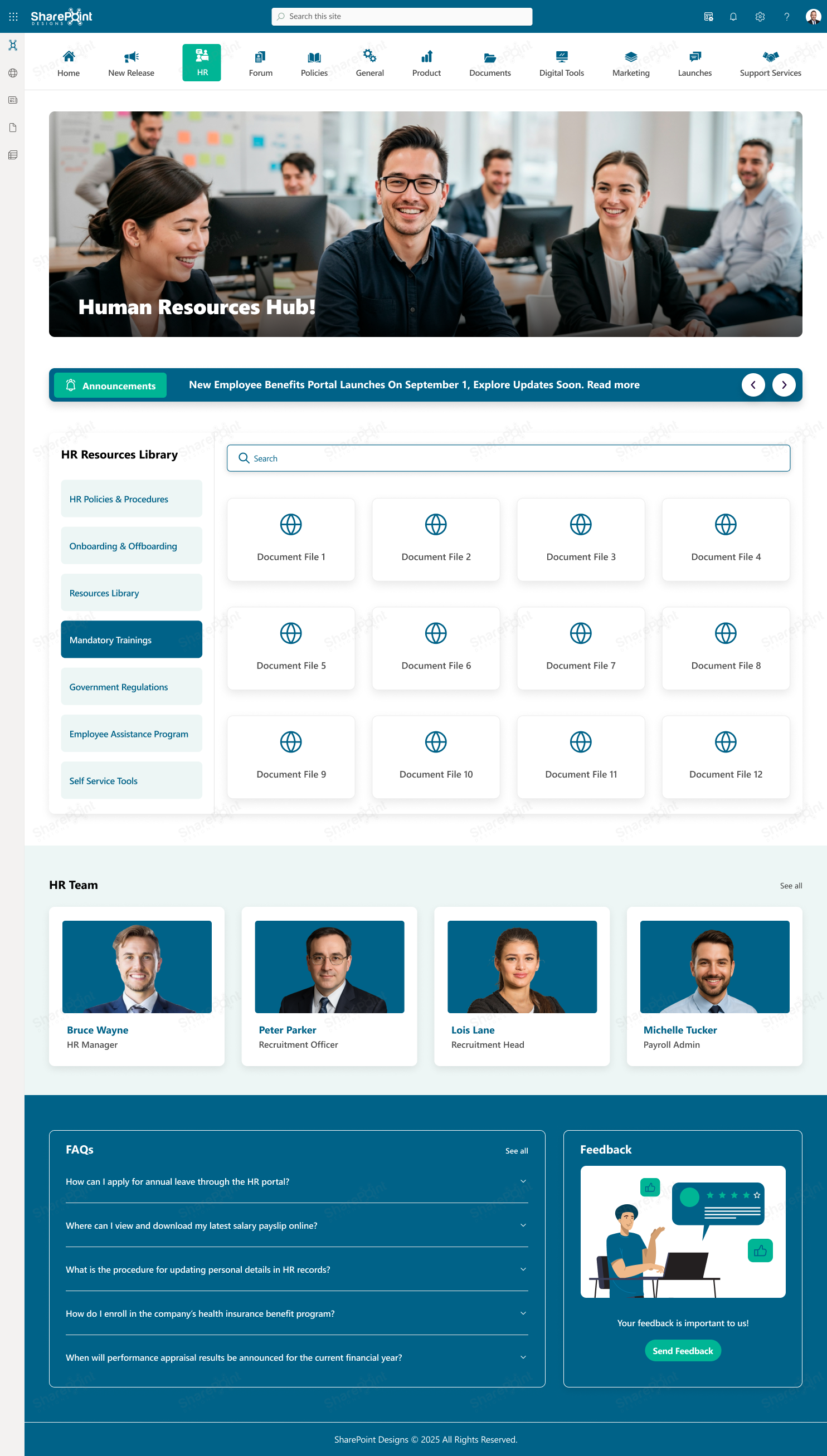
5. Improve Navigation for a Website-Like Flow
Great websites have simple, predictable navigation.
• Use Hub Sites for centralized navigation across multiple sites
• Build structured menus in the header and footer
• Keep labels short: “Services,” “Team,” “Resources,” “Support”.
Navigation should feel effortless, not like a maze.
6. Use Flexible Sections for Modern Page Design
Flexible sections give you web-level control:
• Mix one, two, or three columns
• Use full-width sections for banners
• Add vertical sections for sidebar links
This lets you:
• Present text and visuals side-by-side
• Showcase important content without clutter
• Create layouts that look custom-built
SharePoint’s flexibility is your creative freedom.
7. Keep It Clean, Modern, and Responsive
Design rules to follow:
• Don’t overcrowd pages
• Use spacers and dividers for breathing room
• Preview pages in mobile mode
Modern design is not about “more” but “meaningful.”
8. Set a Custom Page as the Home Page
Once your homepage is ready:
1. Open the page
2. Go to Settings → Site Contents
3. Click the (...) next to the page
4. Select Make Homepage
Done your new branded homepage is now live.
9. Use Custom CSS or Fonts (Advanced)
If you have a developer or SPFx capability, you can elevate your site with:
• Custom fonts
• Animated sections
• Card layouts
• Interactive buttons and visuals
Note: Keep branding accessible and performance-friendly.
Use Cases: Real Website-Like Experiences You Can Build on SharePoint
Here’s a clearer, more actionable version of your use cases explained with what the user actually sees and does.
1. Internal News & Media Portal
Purpose: Company-wide storytelling, updates, CEO messages, campaigns
Website-like features:
• Hero banners
• News feed with categories
• Video announcements
• CEO blog space
Feels like a digital newsroom.
2. HR & Employee Services Hub
Purpose: Central destination for policies, forms, onboarding, and support
Website-like features:
• Tile-based service menu
• FAQs and quick links
• Employee handbook viewer
• Ticketing integration
Feels like an HR microsite.
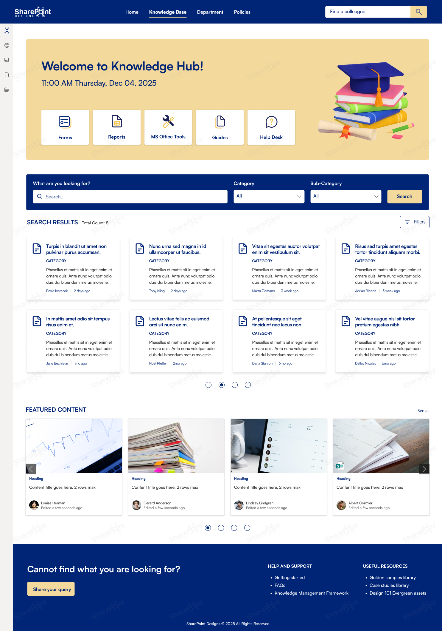
3. IT Helpdesk & Knowledge Hub
Purpose: Reduce tickets, provide self-service
Website-like features:
• Step-by-step guides
• Troubleshooting library
• Interactive search
• Service request forms
Feels like a modern self-service portal.
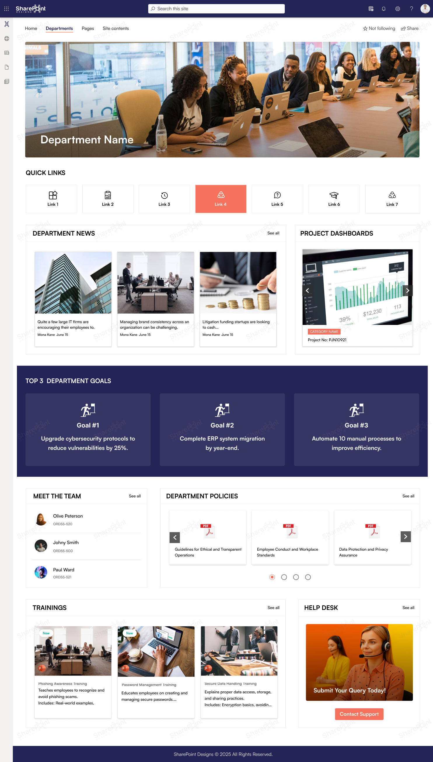
4. Department Showcase Sites
Purpose: Highlight department goals, events, KPIs, and updates
Website-like features:
• Team profiles
• Project dashboards
• Milestone timelines
• Image/video galleries
Feels like a departmental website.
5. Leadership Communication Portal
Purpose: C-level messaging, company vision, updates
Website-like features:
• Executive blog
• Town hall archives
• Leadership message carousels
• Strategy map
Feels like a corporate communication website.
Conclusion
SharePoint can be much more than a document storage space.
With modern design features, powerful web parts, and thoughtful branding, you can create a vibrant, interactive, website-like experience that employees actually enjoy using.
Whether you're building an HR portal, department hub, or full intranet SharePoint gives you the canvas. All you need is the right design strategy.